
If you follow me on either Instagram, Twitter, Tumblr, or
are friends with me on Facebook, you’ve more than likely seen one of my posts
with the #30in30for30 hashtag. I’m sure some of you are a little confused, even.
What, I’m sure you are asking to
yourself, could this cryptic thing,
‘#30in30for30’ possibly mean?
OR if you actually looked at the post or heard me whine
about it (which is more likely), you’d know exactly what it was. Because let me
tell you, it’s a doozy.
OR if this is the first time you’ve even noticed it (which
is also a distinct possibility), you’re probably incredibly confused about what
I’m talking about at all.
Well hold onto your butts, because you’re in for a fun ride.
#30in30for30 is a
title I came up with for an illustration project that I have to do this
semester. But it’s not just any illustration project. It is the illustration project. Steve Hughes,
the illustration professor here, as well as anyone who has taken (or, as is my
case, currently taking) his AD219 class, has described it as one of the most
time-consuming, challenging, and downright stressfully infuriating illustration
projects ever: The Portrait Project.
The Portrait Project
is horrifying. We have to finish 30 portraits before the end of this project.
Ten have to be portraits drawn from live models, ten have to be famous people
that all share a common theme, one has to be of an Abraham Lincoln bust that is
in our classroom, and nine can be any portrait we want of whoever we want. Each
portrait has to be 9 inches by 12 inches (I do not know the metric equivalent
to this, because I am an American and by my nature, I am not to trifle with
“lesser” terms of measurement). There have to be at least five with simple color harmonies, five with complex color harmonies, and five with contrasting color harmonies.
Seem daunting?

We cannot repeat a medium. I know that’s arty technical
mumbo-jumbo you don’t know, so let me delve into that.
We are not allowed to do any more than one of these
portraits in pencil. Only one can be in inkwash. Only one pastel piece allowed.
And so on, and so forth. Granted, we are allowed to mix media (we can have an
ink wash, a pen drawing, and an inkwash+pen work), but still, finding 30
combinations is a lot.
Scared? Still think that art majors don’t ever have to
actually work hard at what they do?
Remember how there are three times that I wrote the word 30?
Notice how I only named two? Well, here’s the kicker. We have 30 days to do
these portraits. I know that’s difficult math, but that evens out to one
portrait a day. And these can’t be quick sketches that I can finish in twenty
minutes or so, these have to be worked on. So far, I’m averaging about three to
four hours on each portrait. So that’s, on average, three to four hours daily.
30 portraits. In 30 mediums. For 30 days.
#30in30for30.
And it’s easily the most hectic, ridiculous, and most incredibly
awesome thing I’ve ever done. Sure, I’m scared of this project. It’s the
most challenging thing I have ever done with my art. And when I first heard about it, I nearly lost control of my bowels. But the amount of
excitement I have for the project is overriding ALL of it.
Now, as of the writing of this post, I’ve finished 12
portraits. And somewhere between the time I finished the first and was about to
start the second, I decided that I wanted to document the entire process. At
first, it was just on my Instagram account (which is still running, with
multiple daily posts), but I decided that I wanted to go a lot more in-depth
with the process of a lot of these mediums. Turns out, a lot of people like to
know about the process of my drawing just as much as the finished project, and a
lot of people have actually asked me about how I do the things I do. Plus, it’s
fun for me to talk about just what the hell I am doing up here in the Great White North.
So I’ve decided to do a series of posts on the whole
process, and each one will have between 4-8 portraits or so, depending on how
long I feel like spending talking about each one. Hopefully, this is insightful
and interesting to you all, because it’s certainly an exciting experience for
me. So here we go: Day One.
DAY ONE: completed March 11, 2014
Medium: Graphite
We got the assignment after a critique of our last project,
so Steven (all art professors are liberal, as you might have guessed, and
prefer we call them by our names) told us to start the project off easy with
something like a self-portrait in a medium we were familiar with. Which is just
what I did.

I decided that I was going to use a familiar medium to do a
quick self-portrait on days one and thirty, so I chose to do graphite (read:
pencil) on day one (I was going to do a pen work on day 30, but I'll get to that later. The previous portrait was thrown together in about an hour’s time,
shading at all, so I could see what I wanted to work on and what I needed to
work on over the course of the month. Personally, I’d like to work on the eyes.
And the chin is a little wonky, but overall, I’m pretty happy with this.
FUN FACT: This was the first time I have drawn irises on a
person in years. The last time was,
oddly enough, on another self-portrait in graphite, now that I think about it,
in the third month or so of my senior year in high school with the help of my teacher.

Wasn’t I a cutie?
DAY TWO: completed March 12, 2014
Medium: Digital
This is about the time that I decided to actually document
the process via either Instagram or blog post, so I actually have pictures of
the process, as opposed to the finished project.
As I mentioned in the introduction, I had to have ten of my
portraits be famous people who were linked together in some way. In a surprise
to no one, I’ve decided to make my pictures famous cartoonists. And I started
with my personal inspiration in terms of cartooning, Bill Watterson, creator of
Calvin and Hobbes, which, in case you
didn’t know, is the greatest newspaper comic that has ever and will ever exist,
as evidenced in these two strips here:


This is one that I particularly wanted to document, because
I get a lot of questions about how I drew Douchebag
Darrel back in the day and how I plan on drawing Douchebag Darrel in the near future (yes, I actually have plans to
restart that, but it won’t be for at least a few months, so calm yourself.).
The process of doing online stuff is pretty simple. I
actually start by sketching out the final image on paper, just like I would
with most of my other portraits.

Once I get it really nice and pretty, I throw some ink on
the lines and erase the excess pencil marks. At the end, the paper looks like
this:

And that’s as far as I go in terms of physical work. The
rest of it is all on the computer. I take the art in and scan it, then send it
via email to my computer. The final inking is opened in a program called Adobe
Illustrator, where I have it perform an image trace. I don’t have any pictures
of this part of the process, because the entirety of it takes about 20 minutes,
including walking from my dorm room to the library (where the scanner is) and
back. It’s really a quick process.
Image trace is a nifty tool on illustrator that cleans up a
lot of the lines on the original picture and cleans up a lot of the dirt
smudges from the original scan. Any remaining smudges I just erase in
Photoshop.
Oh, right, Photoshop. Yikes, is this part time-consuming.
Between the original coloring, secondary shading, changing levels, and adding
effects, this part of the portrait took about 3 hours overall, and let me tell
you, it was rough, but totally worth it. I connected my Macbook to my TV via
HDMI cable, sat on my beanbag, and did a lot of shading with my Wacom tablet.
It was a pretty cool setup.

Once that is finished, I usually save the file as either a
PDF or a TIFF (if that even matters to you). And that is the process of how I
do digital work! After the initial coloring, it looked like this.

I then tweaked the color just a bit on his sweater and added a diffuse glow filter on Photoshop and now
it looks like this.

It was a massive workload, but I am incredibly proud of it.
DAY THREE: completed March 13, 2014
Medium: Crayola Marker
For day three, I decided to branch out a bit. I didn’t want
to exhaust my supply of traditional artistic endeavors just yet, so I decided
to use a medium that was a little…less obvious.
Washable markers.
Now one thing that I noticed about markers-they don’t blend.
Ever. And as I only bought a 10-pack because of laziness, I only had limited
ways to work. Fortunately, a requirement (yeah, there were more requirements
about color harmonies and stuff) was to work in complimentary colors, which
means working with only two colors opposite each other on this color wheel:
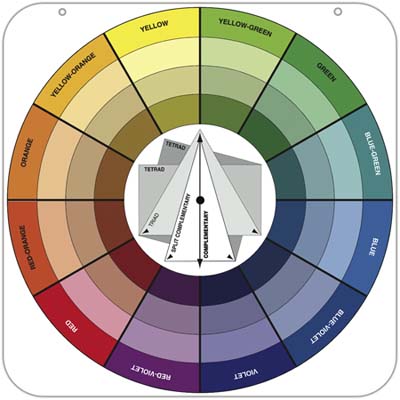
I only had three harmonies to choose from, but I figured out
what I wanted to do pretty quickly.


That night in illustration class, we had our first live
model. I worked with him, and here’s how it all worked out!


DAY FOUR: Completed March 14, 2014
Medium: Inkwash/Pen
I decided that next morning to continue my series of ten
famous cartoonists, and what is a more famous way of presenting cartoon works
than comic books? And who is the most recognizable face in comics? Or at least
one of the most recognizable faces, I guess. I really don’t know much about
Comics apart from the Marvel movies. But what I do know is that Stan Lee is a
huge inspiration and I really wanted to do him.
A portrait. I wanted to do a portrait of him.
Sickos.
Now, like the portrait of Bill Watterson, I wanted to
incorporate something with the most famous character the artist has created. I
certainly had plenty of choices to choose from, but I decided that Spiderman
would be dynamic and fun.
Originally, I was going to do this portrait in charcoal and
pastel, but then I started working on the quick sketch.

And the more I drew,

The more I knew what I medium I had to finish this in. Now,
I really haven’t discussed what my favorite medium to work in is. And that’s
mostly because up until this year, I didn’t really have a preference. I used to
only love working in pencil. Then I fell in love with charcoal. I actually
would have said that charcoal was my favorite medium to work in all of last year,
even when I started doing things digitally. But last semester, I got my first
opportunity to work in ink, and even though I absolutely despised it at first,
I quickly fell in love with it, in a sappy rom-com way as well.


There’s just something that’s absolutely wonderful with
working in ink. Bright and bold colors, putting in minute details, mixing
colors to create new ones, adding wash after wash, it’s probably the best thing
I’ve learned how to do as an art student here. The process, however, tends to
get a bit long and complicated.

After the initial sketch is finished, I trace over the final
lines with pencil onto a sheet of tracing paper. After that, I will color
underneath the lines with a really soft-tipped pencil, usually a 6B. Like so.


After that, I will place the piece of tracing paper onto my
watercolor board. This board is actually a drawing pad. The pad itself is 20
sheets of thick, cold-pressed watercolor paper attached to a thick board on all
sides so that it doesn’t buckle under watercolor, acrylic, ink, or whatever I
decide to put on the paper. What? Never seen a drawing pad like that? Well, I’m
not surprised, because they certainly won’t sell these at Target. No, I had to
buy this sucker online for just under $40.
By the way, the drawing pad has 20 sheets of paper. So I’m
paying about $2.00 per piece. AND IT’S SO WORTH IT but I’m losing focus here.
ANYWAY, I then trace the picture again onto the watercolor
paper, and go at it with inkwashes. I usually put down one flat wash right away
and then layer shadows on top of it to get bolder colors and darker shadows.


After I finished with the washes, I decided to go back in
and put in some line work to make the piece look more like a comic book (eh?
Because Spiderman? Comics? I’M SO FREAKING CLEVER), and it came out like this,
about 12 hours after I started the initial sketch.


Was it excessive? Yes. Was it time-consuming? Of course. Was
it probably a little too much time spent on one portrait? Without a doubt. Was
it totally worth it? Oh hell yes.
NEXT WEEK: I’ll discuss the next five portraits or so, which
include a portrait of Charles Schulz, my new disposition towards Crayola art
supplies, and MAYBE some Babe-raham Lincoln????
ALSO, if you want to stay up-to-date with the #30in30for30
project, check out my Instagram account and focus on the hashtag #30in30for30.
Most of the pictures featured in these blog posts will be on that, and it
updates a lot faster than this old blog site. It won’t be as in-depth as each
of these pieces, but if you just can’t wait to see what else I’ve put together,
there’s your sneak peek!
Until next week!

these are AMAZING. I'm in so much awe at how talented you are!! Good luck with it all! Plus I'm totally gonna follow you now for using the phrase 'it's a doozy'... please tell me you've seen Groundhog Day?! Tegan :)
ReplyDeleteOK... well apparently Blogger won't let me follow you... maybe I'll try back when it's off it's period...
ReplyDeleteWell, hopefully you can follow me! I dig the attention!
DeleteAnd yes, I've seen Groundhog's Day, behind Ghostbusters, it's my favorite Bill Murray movie!